This is a reposting of a guest blog post I did for Dos Family in 2009. I still regularly receive emails asking for the link to download the Swedish Christmas record, so I regularly share it here.
(Perhaps this reposting will kick-start a resumption of blogging in 2024? We’ll see!)
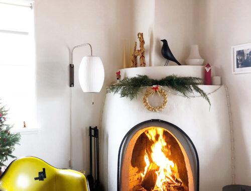
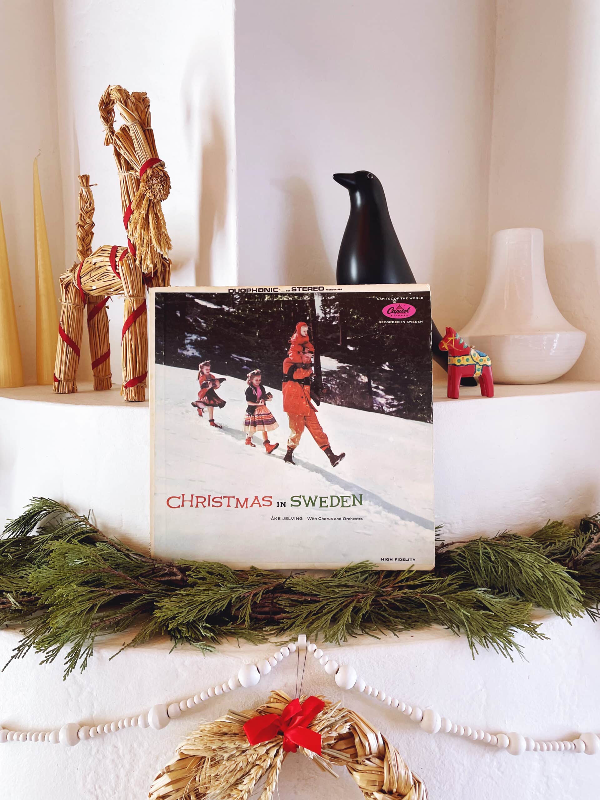
In the United States, it’s not uncommon to hear Christmas music wafting from shop speakers as early as the beginning of November, but it’s not “Here Comes Santa Claus” or “Jingle Bell Rock” that puts me in the holiday spirit. For me, it’s not Christmastime until I put on the recording of Swedish Christmas music that I grew up listening to each and every year: Christmas in Sweden, recorded in 1962 by Åke Jelving and a chorus of parents and children.
This is jovial, happy music, sung with energy and enthusiasm…and with audible gasping and stomping!
Our mother may be Swedish, but my siblings and I haven’t got a clue what the lyrics mean. I suspect that they, like me, sing along phonetically (and badly) in the privacy of their own homes. On Christmas day, we put the record on and leave the singing to Mommy as we all hold hands and dance in a circle, usually around the spread of snacks and glögg on the kitchen island.
My gift to you is a download of Christmas in Sweden. I created the files directly from the record, so you’ll hear all the same snaps and crackles that I do when I listen to the original. I think that just adds to the appeal! Unless you’re a Swede, this may not sound like Christmas music to you at first, but give it time. (And maybe enjoy it with a little glögg.)
To download the album, just click this link and then click the “download” button. A zip file containing numbered m4a files and album artwork will then download. No need to create an account. Easy! This link will expire on January 1, 2024.