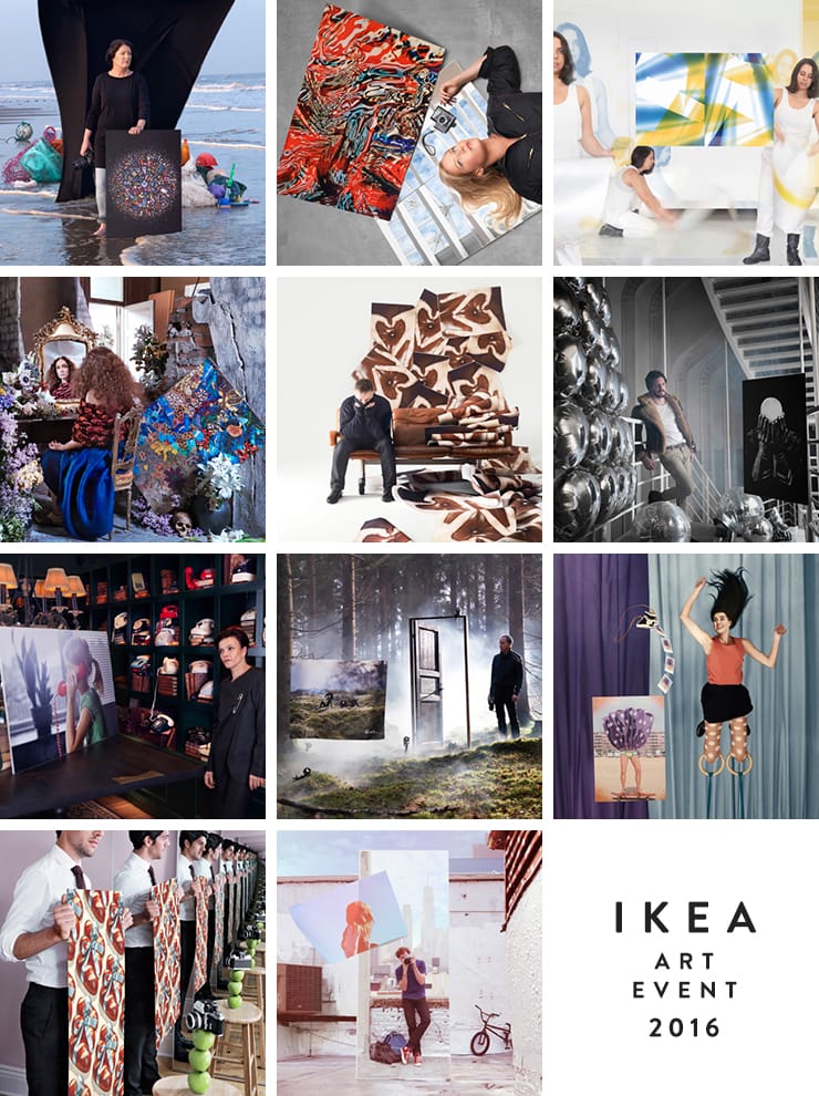
IKEA Art Event 2016 just launched, and this year IKEA has teamed up with 11 contemporary photographers from around the world to create 11 limited-edition posters. The list of participating artists is impressive, including Mandy Barker, Rankin, Jill Greenberg and Bobby Doherty. It’s an eclectic offering with a nice mix of both abstract and figurative pieces, and with a $10 price tag on each, a great way to put together your own collection of large-scale photographic works.
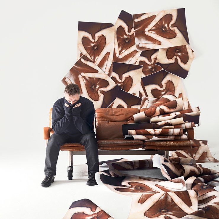
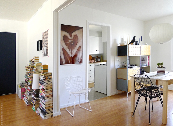
My favorite poster of the bunch is Rankin’s “Sofa Love,” and I’ve hung it in my freshly-painted dining room (yes, that’s a sneak peek!). I’ve been following Rankin’s work since he shot tons of photos of Morrissey in the mid-’90s, including the gorgeous multi-page interior of the Southpaw Grammar LP. There’s often a wink-and-nudge aspect to Rankin’s work, and “Sofa Love” is no exception—if you’re thinking it looks kinda dirty, well, that’s because it kinda does. (It’s a perfect counter to all of those “inspirational” photos of hands making hearts around setting suns, isn’t it?)
To mark the launch of IKEA Art Event 2016, I’m hosting a giveaway for 5 posters! Each poster will come with a $25 IKEA gift card, too—if you’re a winner, you can use it to buy a frame (I put mine in a RIBBA)…and have more than enough left over for plate of veggie balls in the restaurant.
Here’s what’s in the giveaway:
✚ FIVE posters from the IKEA Art Event 2016 collection (your choice)
✚ FIVE $25 IKEA gift certificates
Here’s how to enter:
✚ Visit the IKEA Art Event 2016 page and check out the posters. (Scroll down to meet the artists!)
✚ Leave a comment below letting me know which of the 11 posters in the IKEA Art Event 2016 collection is your favorite and why.
✚ Please be sure that you enter your email address correctly in the comment form, otherwise I won’t be able to notify you if you’re a winner.
**You must be over 18 years of age and a resident of the United States in order to win.
The deadline for entries is midnight ET, May 2nd. I’ll notify the winners via email.
This contest is now CLOSED! I’ll be contacting the five winners tomorrow via email.
Thanks to everyone who entered! ❤️
This is a sponsored post. IKEA is a registered trademark of Inter IKEA Systems B.V. and is used with permission. The views, ideas and opinions expressed here are my own.
152 Comments
I would totally pick Robin’s print with the whimsical little Skuggis. Love that it has a silly children’s book vibe to it but would still look good in our bedroom. I’m surprised I never saw this particular print when viewing the collection at my local ikea.
I like the girl on the phone. Not part of this but I also love the swimming girls canvas but it was out of stock when it was on sale for $30 which makes it hard for me to buy it for $40 but I may have to just break down and go get it
I love Nathalia Edenmont’s Forces of Nature – amazing play of color, texture, and pattern. It reminds me a bit of Gustav Klimt’s Stoclet mosaics!
I like the hippie looking one by Nathalia.
Thanks for the chance!
I am in love with Anna Beach by Chad Moore. LOVE.
I like the Anna Beach!
I like the poster by Bára Prášilová with the purple polka dot skirt. It’s funny and playful. I think it would be perfect for a large wall in my bathroom and would go with the purple towels I have!
I love the Robin Gindre print– it’s unexpectedly playful 🙂
I love Anna Beach– it feels so summery and classic.
I love lost at sea by Mandy Barker – I like when artists use found materials and I think she brings attention to an important cause. Thanks!
I love the poster by Tonya Long for its abstractness and simplicity!
Love the whimsy of Anna Beach by Chad Moore!
I really like the Chad Moore print. Reminds of a relaxed Saturday morning spent at the beach or a park and I think it’ll go well with my collection of art and photos.
The Chad Moore print makes me think of the summers of my childhood – there’s a slightly hazy, sleepy, been-too-long-in the sun feel to it that I love.
I like Lost at Sea and Force of Nature, but Sofa Love wins my heart. My family and I often make hearts with our hands, so it’s somewhat sentimental to me.
I love the sundress print by Bára Prášilová – My (4!) sisters and I grew up like this – fem and pretty, but running around in the street with the skater boys next door. My daughter is now 6, and this perfect combo of priss and spunk.
I love the bread print by Bobby Doherty!
Cool give away! Everyone could use some affordable art! I like the Bobby Doherty bread print. Who who doesn’t love bread? I want all the carbs, in my mouth, all the time. Plus I love baking… And most of the walls in my house are bare. Scribsfarm(at)gmail(dot)com
Mandy Barker’s lost at sea is my favorite. It’s beautiful and sad at the same time, and it brings attention to an important environmental issue.
Love the lost at sea print!
The Skuggi on is my favorite – it contains an air of mystery to it. And I like the playfulness vibe it gives off.
I like Force of Nature – kind of amazing that all those bright colors and patterns are actually found in nature.
I like the colors and movement in Nathalia Edenmont’s poster. Can’t have too much color in my house.
I love Nathalia Edenmont’s piece!
I love the one HD Skuggi by Pascal Gindre.
I think it is quite playful and calm at the same time.
Bobby Do(ug)herty’s is my favorite! The color of that ribbon… The print’s both warm and fun.
I like force of nature. The colors are beautiful.
The sundress just makes me giggle, and wonder what the people farther up the beach may be thinking.
I want Robin Gindre’s print. Whimsy and nature together- and it makes me smile
I love Nathalia Edenmont’s Forces of Nature – great texture
Force of Nature. Nathalia Edenmont. It speaks to me.
Totally love Sofa love!
I love Bobby Doherty’s Bread poster – so surreal and retro, perfect for a big blank wall in my kitchen!
My favorite is the Poster, HD Skuggi, I like the nature scene combined with the cartoon characters.
i love the Mathieu Cesar ‘Fingers of Steel’ print. i’ve always been a fan of portraits and this one jumped out to me because it’s intriguing. plus, my dad loved to photograph in black and white when he was in college so i have a soft spot for it.
Can I pick two? The Chad Moore print because he shot it on 35mm film and that’s still my first love. Also, it just oozes summer. The Rankin print because of its tongue-in-cheek sexiness.
I was drawn to the “Lost at Sea” print by Mandy Barker. From afar it reminds me of stained glass – must be my Catholic upbringing – but then when you zoom in you see all the myriad items that make up the image. You’d be finding new things to comment on every time you looked at it – how fun!
It’s difficult to choose one, but I’d pick Chad Moore’s Anna Beach photo. The light, color and energy are wonderful. (And your dining room and kitchen look great!)
Chad Moore’s Anna Beach is so dreamy!!! I think I’d hang it in our formal dining room for a little contrast. Wish these were available online!
I love the colors in fixing the light by Tanya Long. Most photography is something I enjoy on a smaller scale, but this one is great in its abstractness.
I love, love, love Chad Moore’s double exposure picture of the girl. I have a big wall I’ve been trying to do a gallery on, but I never like it and take everything down after a few days. I think this poster is the answer. I think this poster is what my wall’s been waiting for.
I can’t decide between the Nathalia Edenmont print and the Rankin print. I’m leaning toward the Rankin because it’s oddly sexual?
I love Mandy Barker’s “Lost at Sea” photograph.
It speaks to the talisman rat in me. Notice that I didn’t say “pack rat”.
(Can’t wait to see your redo.)
I love the familiar worked into abstract in Force of Nature. Plus the colors are great.
Force of nature! I love art that is busy & colorful- you can find something new every time you look at it.
Loving Chad Moore’s Anna Beach 🙂
Mandy Barker’s “Lost at Sea” – I’ve walked many beaches and collected a lot of debris, so it hits home. And I love me a mandala.
I draw caterpillars; love the butterfly one by Nathalia Edenmont– I’ll have to snag it on my next trip to Ikea.
Force of nature for sure. Beauty and chaos.
Force of Nature- those colors! It’s something you would look at over and over and notice something new every time. I love the bread one and the skateboard too- both a bit of whimsy with fantastic palettes as well.
I weirdly love the ‘Sofa Love’ poster. It just looks so good on the wall.
Thanks for this, what a fun collaboration! It’s hard to pick, but I think the bread is my favorite. It was something about the texture and detail of the bows.
I like the Chad Moore one. Colors would work for my house.
The Umbilical Cord by Annika von Hausswolff. I find it intriguing.
I like the Chad Moore poster. Definitely fits the relaxed chill vibe I want for my space.
I was immediately drawn to The Force of Nature poster. The colors remind me of the shimmering, brocaded, beaded dresses my grandma is wearing in old photos of parties in the 60s’.
my favorite poster is the chad moore poster.
Lost at sea! Pick me!
My favorite is Motif by Jill Greenberg. I find beauty in abstract art.
I love Force of Nature. The colors are great!
Lost at sea! The colors! The random!
Hd skuggi. Very unusual and would be a wonderful adornment to my boring hallway
Really like the umbilical cord by Annika von Hausswolff. Love the light and subject!
My favourite poster would be the Force of Nature collage by Nathalia Edenmont. Her attitude is admirable and her ambition of finishing her product in 8 months is fascinating. I mean that was so much work and it was truly worth it because look at it, it looks gorgeous!
May favorite poster is Nathalia Edenmont’s poster. It is the ONLY one with any sort of animal in it (butterflies). I do not do “people art”. 🙂
Dear Anna, I hate to be *that* person but… sneak PEEK please 🙂
Hah, just a typo—I’m not actually that stupid. 😉
I love Lost at Sea. I love the combination of random objects to make art.
I really like the playful surrealism of Bobby Doherty’s bread print.
Love love love the Anna Beach by Chad Moore. Totally digging the sunny, summery vibes!
My parents had a “Manhattan!!” poster by Tony Graham in our hallway. I remember studying that poster from a relatively young age, staring at it for hours, trying to find all of the hidden locales in the quiz that surrounded the illustration. It consumed me with wonder and I never got tired of looking at it. It fills me with a wonderfully nostalgic feeling when I see it now in my own home. I get a similar feeling from Mandy Barker’s piece. There is always something new to see, to ponder, to talk about, whether you’re looking at if from afar or close up. It would also be an excellent catalyst to discuss the importance of environmental conservation and the fragility of nature with my two young children, especially since my oldest is discovering discarded trash in the playgrounds of Brooklyn and wanting to pick it up and put it in the trash bins. And there is an empty space in my home that has been waiting for a special piece. Thanks for your consideration, Anna!
Nellie
nsanchis@gmail.com
Nellie, thank you for reminding me of that Tony Graham poster! I haven’t thought of it in years.
Yeah! It’s a personal fave and I’m glad I have it!
Anna Beach by Chad Moore. It’s simple but makes me think of a good weather day full of adventure (my favorite).
The Anna Beach photo is my favorite
My favorite is definitely the Bread poster by Bobby Doherty. The color combo of brown and light blue is nostalgic for me… plus, who doesn’t love an homage to BREAD? 🙂 Thanks for hosting this.
I like the color and whimsy of Nathalia Edenmont’s poster.
I love the bread poster by Bobby Doherty.
I looove Jill Greenberg’s poster and I love the process behind it, I might have to go search out more of her work now. Thanks Anna!
I love the bread poster by Brian Doherty! It reminds me of all those fantasitic advertisements from the 30s & 40s and would look amazing in my kitchen!
I adore Rankin–but the bread print by Bobby Doherty is a close second!
My favorite was Sofa Love… huge Moz fan and Rankin fan as well. It’s cheeky
I really like Mathieu César’s ‘Fingers of Steel’. The contrast is a complete knock-out.
My favorite is the Tanya Long poster. It works nicely with the PS collection and I could see it hanging next to my PS 2014 wall hanger nicely. It reminds me of recent exhibition posters at the Stedelijk Amsterdam.
Anna Beach is my favorite!
By the way, I love your ‘Lego Shelf’ (not sure how to call it… 😉
Hah!! It’s an Eames storage unit. It does look like a Lego!!
HD Skuggi by Robin Gindre! Just bought a house in the NB Heights (!) and need a good photo over my bed. Horizontal + fun sexy landscape = perfect over bed print!
I love the HD Skuggi print. It’s playful, adventurous, mystery, morning dew or after the rain, with the quirky characters. Nature is so soothing to me. I was sooo excited when I found the rotating wallpaper under windows 10 that has all nature prints. Everytime I’m done working on a project I get a soothing pic at random. (I’ll take any moment of calm I can in my crazy life).
Oh man, I like lost at sea and force of nature! Tough to pick but I think lost at sea is my fav.
I love Ranki’s subversive sexiness.
I like the skirt, but i’d hang it upside-down!
Love the photo by Chad More!
I love the Mathieu César poster. It has a dark feeling to it that I enjoy.
Love the sneak peek! Can’t wait to see more 😀
wow, this is tough. i think i like the doherty bread poster the very best – there’s something so odd about it, and i love it.
I LOVE the Motif by Annika von Hausswolff. The lighting from behind is phenomenal. I work in a windowless building (the joys of working in a performing arts center) and am always looking for pieces to help lighten up my work space.
Sofa Love! It’s just too funny!
I like the Mandy Barker design made from found plastic objects. It looks like a stained glass window from afar, and the small objects composing the design make for sustained interest, plus the cause is near and dear to me, having grown up by the shore.
Lost at Sea is my favorite, although it’s a tough choice.
I looove the Anna Beach Motif poster by Chad Moore. I’m a big fan of any composition involving people turned away from the camera. I noticed it a lot in your work as well, and I just love the mysterious vibe it gives. It makes the viewer fill in what the person looks like and why they’re turned away.
Bread, by Bobby Doherty. I spend so much time working from home and my office space, while one of my favorites, always feels serious. I love that it’s both whimsical and very orderly.
Sofa Love!
Force of nature! The organicness of the price speaks to me. I have just the place the hang it!
Rankin’s “Sofa Love” is my favorite, by far. The reasons are as follows: I enjoy his work. I appreciate his humor. This piece would look amazing in my living space. And, of course, butthole.
I would. Have to say the bread poster…because i couldnt figure out what they were until i read the name ! Would look great in my kitchen
Love Rankin’s Sofa Love —it’s simple yet a bit cheeky, which is perfect for my place! Spread’s love, in a Rankin way.
I like the back of the head of the girl with the long hair. It reminds me of youth and summer evenings. Lisashelbyhayward@gmail.com
Oh, how wonderful! Your place is really looking great.
I love the ‘Lost at sea’ poster by Mandy Barker. The design is striking, and the message is important.
The pretzel one by Bobby Doherty is so sweet! It reminds me of wrapping paper at Christmas!
My favorite is the poster by Bobby Doherty! So cute and fun!
Force of nature is my favorite!! Love the eyes.
I love the Anna Beach print by Chad Moore! It’s just so dreamy and make me want to go outside and lay in the sun.
I love the piece by Chad Moore, the colours are right in my wheelhouse (actually, they ARE the colours of my wheelhouse!)
I love the Rankin as well!
I like the one with a little girl holding a phone by Annika von Hausswolff.
I also love Rankin’s “Sofa Love”. It’s simple and clever, goes with my decor. Thank you for the inspiration!
My favorite is Rankin’s “Sofa Love” too! Just dirty enough to make me smile
I love Mandy Barker’s print. It’s beautiful at first glance then sad once you understand what you’re looking at. I like that 🙂
I would pick “And Blue” by Tanya Long. We just redecorated our living room after 6 long years and the yellow color in this poster would go with the yellow wall accent that we have. I have been searching for just the right piece of art to put on our whilte wall and am being careful about picking the right piece for my spouse who is very particular. I love the simplicity of this piece and the beauiful rich colors.
I love Mandy Barker’s piece! It’s visually stunning with the color contrast and it sends an important message. Beautiful!
I love the HD Skuggi poster by Robin Gindre. The setting is so pretty and natural, then adding the little cute characters just makes it totally unique!
I love the staged photography of Annika von Hausswolff. The Umbilical Cord spoke to me because I believe the heart and soul of our human experience is, really, communication. There is also something so nostalgic about the old-school telephone (I’m 40– so I recognize it!) and it reminds me of Sunday calls with my grandparents. The photograph makes me wonder how future artists will memorialize the way we communicate with each other…
I like Mandi Barker’s piece. She made something soothing and organized and beautiful out of something that is actually horrifying in its own right. It reminds me to remember the scary realities of our world but also the beauty in it too.
The poster by HD Skuggi! 🙂
I love the motif by Chad Moore! So happy for spring.
The Fingers of Steel print completely drew me in. The black and white is so me and my current decor!
I would l o v e the “Sofa Love” by Rankin. So good!
OK, I don’t live in the US (I am over 18 though) but I would like to say that if I were I would pick the plastic mandela pattern by Mandy Barker. I think it makes something beautiful and poetic out of a serious problem that the planet is facing and it raises awareness of that problem.
i like bread, reminds me of mendl’s : )
I love the bread poster Bobby Doherty so much!
I love how its a real photo but looks so fake, like a 1950’s advertising photo. Plus the blue ribbons? I am obsessed with cornflower blue ribbons.
I love the Mandy Barker “rose window of trash.” I could look at it for hours — the way it glows on the black background, the intricate detail, the feeling of sitting quietly in a cathedral. It does not make me feel guilty, it does make me want to be more careful about what I buy/use.
I like the Jill Greenberg motif!
The bread poster would be awesome in my kitchen! Thanks!
The red abstract painting is pretty cool (by Greenberg).
Mandy Barker’s is my favorite. I like the circular shape made up of little pieces, and how she created beauty while raising awareness of a serious issue.
HD Skuggi
Lost at Sea is really beautiful, if sad. A great reminder to be thoughtful when choosing what we purchase and surround ourselves with.
Finding little fragments of butterfly wings when I’m hiking always gets me – such fragile little things that can travel insanely long distances. I’d love Nathalia Edenmont’s Forces of Nature.
Nathalia Edenmont’s Forces of Nature. I love the colors of the butterfly wings.
I love the Chad Moore poster! The colors and summer vibes make me happy 🙂
I really love Pascal Gindre’s poster. It reminds me of the little spirits from “Totoro” and I like that he called his little animations “Skuggis.” Just went shopping at Ikea today and got a super cute bookshelf and frames!
Nathalia Edenmont’s is my favorite by far. I just discovered your blog and I’m hooked! 🙂 thanks for hosting the giveaway!
I like, “force of nature.” It’s interesting to look at and study; I could spend quite a bit of time looking over the various details.
lost at sea is definitely favorite. I love standing by the waters and literally getting lost in my thoughts so that’s what the picture made me think of.
Sofa Love!
Rankin’s Sofa Love is hands down my first pick! I love how it would activate my space with some edgy, unexpected energy. Great pick, IKEA (and Anna).
Skuggi and Anna Beach FTW, because I can’t pick just one — each one appeals to a different side of me. Story of my life: sitting on a fence because I like it all.
I really love Rankin’s “Sofa Love.”
I like the Tanya Long poster. It’s so light and clean feeling. Thanks!
I like “Force of Nature” for the amazing colors and patterns.
This contest is now CLOSED! I’ll be contacting the five winners tomorrow via email.
Thanks to everyone who entered! ❤️
Ok, so the sneak peek was excellent—but SO WANT to see the real thing ! Is the dining room Swiss Coffee too? What finish? So many questions !!!
Hi Rocco, yes, it’s Swiss Coffee! Flat finish. I actually just took photos of the rest of the dining room over the weekend, so…stay tuned. 😉