Just for fun, I made some abstract coloring pages to download for free! I know a lot of us are in need of a little creative outlet right now that’s not related…
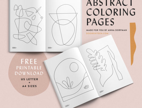
Just for fun, I made some abstract coloring pages to download for free! I know a lot of us are in need of a little creative outlet right now that’s not related…
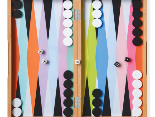
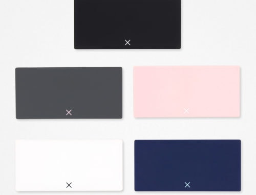
Whoa. How amazing is this backgammon set? So nice. After coming across this cute yatzy set the other day, I started thinking about what other games would be nice to see redesigned.…
Do you remember where you were when Jessie Randall’s living room was on the cover of Domino? The year was 2006. Door Sixteen was a newborn, and Domino magazine was IT. When…
I’ve been spending WAY too much time lately looking for a well-designed pill organizer. My search history contains embarrassing terms like, “DWR pill organizer,” “Danish pill organizer,” “cutest pill organizer,” and, out…
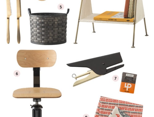
I have a folder on my desktop called FUTURE BLOG. I endlessly drag URLs and photos into that folder, with the distant idea that someday I’ll get around to sharing this stuff…
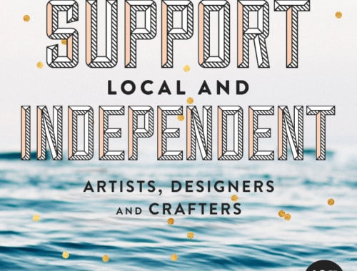
For the 10th year running, I have made a personal commitment to buy gifts for my friends and family from local and independent artists, designers and crafters this holiday season. As I…
I love every single piece artist Karin Cyrén has created for a new limited-edition series of posters at Fine Little Day! Such a great use of color, and her bug illustrations make…
Oh gosh, have you seen the new Schoolhouse Electric collection for spring 2016 yet? SO MUCH GOOD STUFF. I got the new catalog in the mail the other day—they shot the whole…