Photo: Tsao & McKown (Rhinebeck, New York) I’m long overdue (um, it’s been six years—oops) for a black house roundup post. I chose to lead off with a gorgeous Victorian farmhouse renovated…
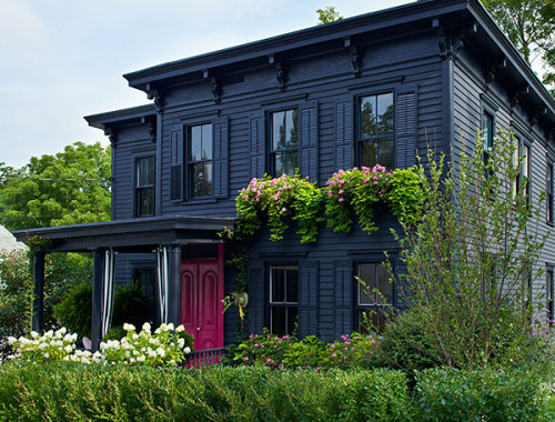
Photo: Tsao & McKown (Rhinebeck, New York) I’m long overdue (um, it’s been six years—oops) for a black house roundup post. I chose to lead off with a gorgeous Victorian farmhouse renovated…

I have a feeling this is one of those things that everyone was into five years ago and that I’m just discovering now, but I’m suddenly digging black-and-white composition book prints. What…

In my last post, I mentioned having bought a queen-size mattress for the new apartment. Knowing that we were going to be making that upgrade, I bought new sheets a couple of…
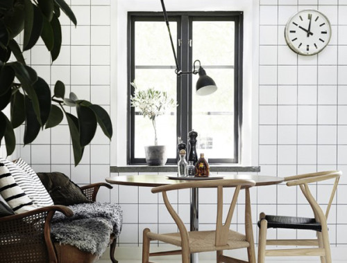
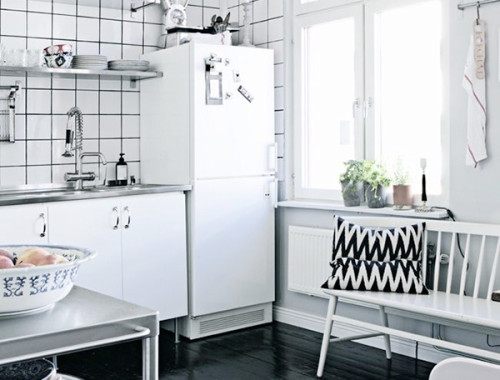
Today I’m small on words, but big on pictures! After putting together my previous post about that amazing Swedish apartment, I got to thinking about how nice square tiles are—whether aligned in…
Something happened with the light this weekend. Despite the three feet of snow still piled up along the side streets in the City of Newburgh, it suddenly feels like spring is coming.…
Now that the floor demolition is complete, we’re in a bit of a race for time to get a new floor in place and have the radiators reconnected. Fall in upstate New…
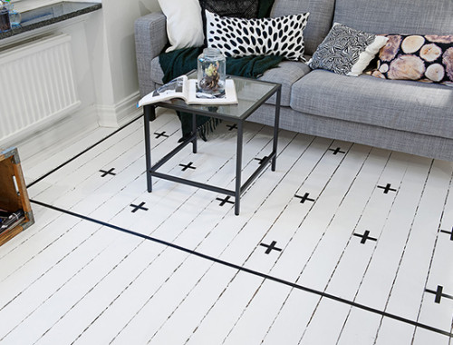
✚ Photo by Lönngren/Widell for Lovelylife Last weekend we had another plumber come to the house to take a look at the work we need done in the kitchen — removal of…
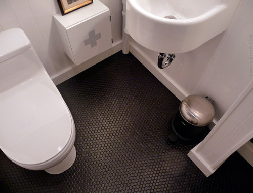
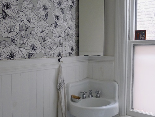
I get a surprising amount of traffic here on the blog from people searching for pictures of black tiles with black grout (or black pennyrounds, or just black bathroom floors in general),…