My apologies for how long it’s taken me to announce the winner of the Frida Kahlo book giveaway! There so many entries, and I underestimated just how long it would take me…

My apologies for how long it’s taken me to announce the winner of the Frida Kahlo book giveaway! There so many entries, and I underestimated just how long it would take me…
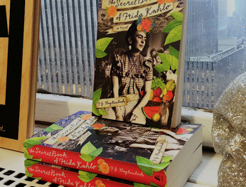
Remember the book about Frida Kahlo that Lisa Congdon and I collaborated on the cover for? Well, The Secret Book of Frida Kahlo was finally released for sale on Tuesday! Woo-hoo! I…

In October 2011 (yes, almost a year ago!), I started working on the cover for the September 2012 publication of Mexican writer F. G. Haghenbeck’s The Secret Book of Frida Kahlo. That’s…