✚ Photo by Lönngren/Widell for Lovelylife Last weekend we had another plumber come to the house to take a look at the work we need done in the kitchen — removal of…
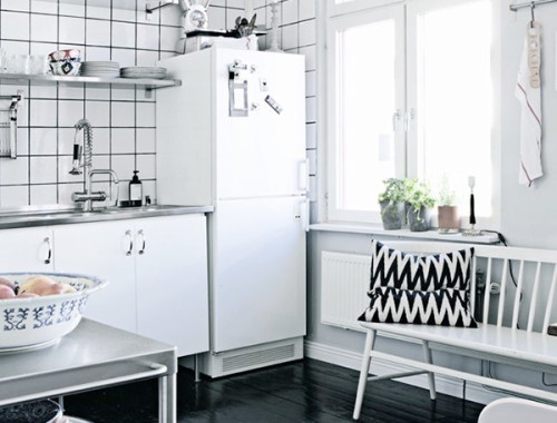
✚ Photo by Lönngren/Widell for Lovelylife Last weekend we had another plumber come to the house to take a look at the work we need done in the kitchen — removal of…
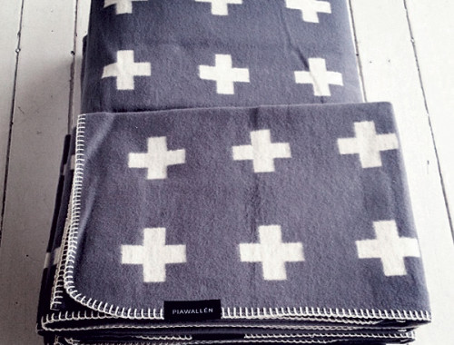
If there’s anything I don’t need, it’s more blankets. I don’t know what it is about candle holders, pillows and blankets, but I’ve somehow wound up with way more of all three…
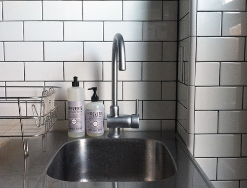
I painted the kitchen this weekend, and yes, I got just as bold and crazy with my color choice as you’d expect: GRAY. Valspar’s Filtered Shade, to be specific, in a matte…
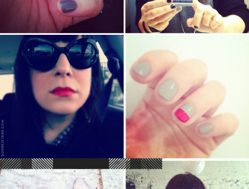
I thought about titling this post “ME ME ME ME ME ME (and a little more ME),” because let’s face it—this is a whole bunch of ME. I don’t post a lot…