I’ve been obsessed with interior designer Frédéric Méchiche’s Le Marais loft for a while now, and I’ve squirreled away a bunch of photos of it from various sources and taken at various times over the past decade. I keep looking for an opportunity to sneak them in with another topic, but I’m starting to think they really deserve their own post.
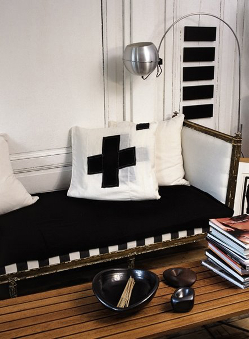
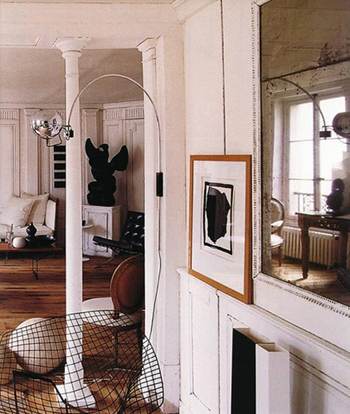
Okay, so this is pretty much the ultimate interior moment for me. I honestly feel a tug on my heart looking at this photo. Look at the upholstery on that daybed! (And the cross pillows!)

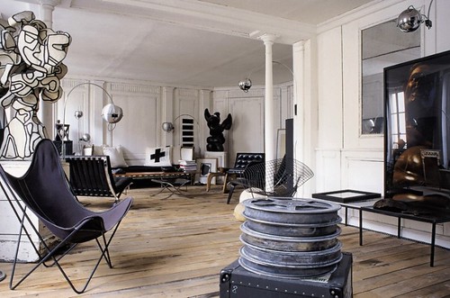

What, you don’t have original works by Joseph Beuys and Jean Dubuffet in your living room, too?? It’s not often that I find myself wishing I were rich, but if I suddenly were to come across millions of dollars, I’m pretty sure I would spend a whole bunch of it on really fabulous art that I could see in three dimensions, in my living room, every single day.

Really, does it get ANY better than this? No, it does not! The combination of black and white, old and new—the contrasts, the textures, the light, the wood, the glass, everything! I’ve never wanted to climb into a set of photos as much as I do these.
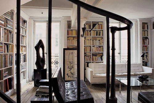
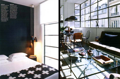
These last two photos are more recent, and may have been taken at a different property:
It’s almost too much to handle, right? Sigh. SIGH.
(Images from Marie Claire Maison and Elle Decor UK;
via Automatism, Interiors, and Apartment Therapy: SF)
48 Comments
I find I’m craving a rug or two, but otherwise AMAZING. Glorious spaces filled with offhand style.
Thanks for the collection.
yyyyyyyyyyyyuuuuuuuuuuuuuuuuuuummmmmmmmmmm.
bastard.
I love, love, LOVE the last picture the very most. You are introducing me to so many things and people I have never heard of. Thanks, Anna!
I agree, these are gorgeous Anna. Can I ask one question? You have such a strong aesthetic, and it would seem you never waiver from it. Do you ever get tempted by different styles and start to lose your vision? Sometimes I’ll see a beautiful coastal or country house (something very different from my flat-roofed modernist house!) and think how fantastic it looks and then find myself almost subconsciously trying to incorporate that look into my own before I pull myself up and get back on track. Does that make sense?
Just wondering. I have such admiration for your sense of style and your ownership of it.
Heavenly. And Barb F ~ would love to hear Anna’s answer to that question! I too find myself having the odd Cath Kidston moment (or ‘whatever’ moment – something very different to my regular style, at any rate..)
The textures and contrasts are amazing!
~I too find I am tempted by different styles and often become frustrated when the mixed results appeared as if Sybil was my interior decorator-sigh!
i had to star this in reader; amazing! the contrasts are so incredible. i’m in love with the first + third pictures. and a little bit with the floor in the second!
God those floors are gorgeous.
OH! Anna, it’s so easy to see how much your home is inspired by Frédéric Méchiche. Very interesting to see where you aesthetic comes from!
Love it! I really dig the use of the crosses in his design.
This is my design porn.
ooooooo those lamps…I am loving those lamps!
Really pretty!
speachless.
speechless too.
I can see why you like this so much – the man has a chair fetish just like you!
I echo the comment about a couple of rugs, you can still have that beautiful worn texture but get something nice for your feet too.
This is beautiful but I am way too lured in by color to ever manage a black, white, and wood look. Maybe black, white, wood, and a little itty bit of rainbow? Ha.
No ‘Sign’ should come from you, Anna. In my opinion, your house has it, too! 🙂
Cassie & coral: I love rugs, too, but I actually feel kind of excited by the fact that he (apparently) has NONE. Bruno has a little “issue” with rugs, so we always wind up having to remove them. I’ve decided to believe that Méchiche also has a cute little dog that keeps him from having antique Persian rugs all over the place, too. 🙂
Barb F & Jo: See, I think I have a lot of different style going on in MY house, too! I gravitate toward American and Scandinavian mid-century furniture, but I wouldn’t describe my style as being particularly “retro”. Those classic pieces are still very current many years after they were designed, and they mix well with more contemporary pieces AND antiques. Living in an old house, it’s very easy to mix in furniture from a lot of different eras – it’s a reflection of the natural progression of time. I think it’s harder to do that in a newer house where you’re constantly having to fight nature.
For me, it really always comes down to contrasts. It’s a theme I’ve been obsessed with since I was a teenager – it’s very goth, the black/white/one color thing. I even carry this style over to my hair color! I’m very fair, so I dye my hair black (and have for 20 years). It’s the same principle. I find that if I stray from this path (like the few times I’ve done my hair red or pink, for example), I get easily distracted and have a hard time figuring out what it is I’m trying to achieve. Does this make sense?
That said, I was SHOCKED (seriously) the first time someone described my decor as “black and white”, because I don’t really see it that way. I’m so sensitive to colors and how they interact that I really do see even different shades of white as being distinct and unique. And don’t even get me started on the wide world of grays!
Oh wow, how GORGEOUS! Could the lighting fixtures be any more perfect? And the wood floors, ahhhh…. This such a great inspirational resource, thank you!
What I love the most about this is the small details that almost seems forgotten. Like the way the art stands on the wallpanel and the worn (sorry – my choice of words are poor – I am swedish) floor and the messy bookcases and those wooden boxes. The space is wonderful of course but i think this guy could make whatever area look this great. And I imagine he could have managed without the design icons as well. Genious!
I am very pulled to this aesthetic as well. It is definitive but change comes as each piece scratches, cracks and fades.
I love the white/cream book bindings/covers. And thinking about those (unpainted)suede floors.
Gorgeous – is that a giant gargoyle in the corner? Love the architectural details too!
Malo: I agree completely. I love how casually the artwork is displayed, rather than being in a glass box somewhere. I did a double-take when I saw the stack of film reels — that’s an important piece by Joseph Beuys (galvanized reels of a Ingmar Bergman film), and it’s just sitting there in his living room!! And the Jean Dubuffet piece, too.. just right there, where you can touch it if you want. Fabulous. This is how works of art should be treated and enjoyed. I can’t say enough how happy this living space makes me for so many reasons.
You are my style queen!
This is all so interesting to read. Loved your answers to the posts. It is interesting to get inside your brain and to read about how you see the differences in shades of color and how you also like contrasts. If I paint my walls a light shade, my walls look almost non-existent to me against my white trim. If I have a dark color (huge contrast) on my walls, it feels srisp and “done”. But I looove your stuff and it always looks perfectly done. But to translate that to my house is tough for some reason. Dunno. Just the ramblings of a sleep deprived momma… 🙂
Um, I do believe the word I was looking for was “crisp” as “srisp” (as far as I know!) is not in the English language… LOL I gotta go to bed… 🙂
Frédéric Méchiche’s loft in le Marais, 4th. arrondissement of Paris. A bit out of date now as a place for living. He got also in the past a beautifull XVII th. Cent small house in the south of France, near Lubéron… I think you cant seat there… and there here, this is to precious or to fragile 😉
So now that you’ve introduced me to the art of Joseph Beuys I have a question. Is the pillow and the blanket with the crosses also influenced by Beuys? After a little research I learned that Beuys spent time in a military hospital during WWII and he once covered a grand piano in felt with a red cross on it (very military hospital blanket looking). Interesting.
Oh yeah, and the galvanized film reels, didn’t even realize that was a sulpture. Duh. Thanks for the art history lessons Anna!
dee: The blanket is by Pia Wallén, a Swedish designer who uses the cross as a common motif in her work. I don’t know that she is influenced by Beuys (who does use the cross often – did you see he also wrapped a cello in addition to the piano?) so much as the crux quadrata/Greek cross (cross with all arms the same length) itself is influential on a number of artists and designers. The red cross illustration in the bedroom photo, for example, is by Jean-Pierre Raynaud, and you’ll see the cross appear in other works of his, too. I don’t want to try to speak for all of them and make too many assumptions about why the cross is so influential, but when you consider the various associations with war/military, medicine/healing, and Christianity, there’s a whole lot of possibilities. Incidentally, the Red Cross claims that their symbol derives from a reversal of the Swiss flag (and has no religious association), rather than from the Greek crux quadrata. Interesting stuff.
What’s most interesting to me, though, is that Méchiche has work by all three of the people I mentioned, plus those amazing pillows (which to me look very much influenced by Beuys, not only in the imagery but in the quality of construction). I wonder what Méchiche’s attraction to the cross is.
The first piece of real art I bought was ‘Ghost’ by Stephen Bambury (a New Zealand abstract painter who uses the cross a lot in his work – he’s also a lovely man):
http://snurl.com/g6vck
It’s a small work but very greedy in terms of the space it needs. It holds an entire wall all by itself.
Interesting discussion going on here, Anna! Am enjoying it heaps.
I like your style very much. The only thing I do not like is the picture with the red cross. It remind me a Hospital.
Somehow last night I failed to mention Kazimir Malevich, who used the cross as one of his recurring Suprematist motifs. (Do a Google image search for “malevich cross” fi you’re curious…) His “white cross” painting was famously vandalized with a spray-painted green dollar sign a few years ago.
Oooooo, those are some sexy bookshelves!
Your blog is so neat! Thanks for being inspiring.
Wowzer, I had no idea so many artists used the crux symbol. But I think I’m getting an understanding of why. It is one of those incredibly meaning loaded symbols that just about everyone responds to. It seems to resonate in our collective unconscious. A good symbol like the crux can open a door to the 4th dimension. Unfortunately that power has been exploited brilliantly by those who want to sell something. A good product logo has the power to speak volumes and resonate in us deeply just not with the same intent as pure art. Perhaps it was that distain for the use of symbols for monetary gain that prompted the person who spray painted the dollar sign on Malevich’s cross. A strong statement but I think aimed at the wrong object.
the french are just insanely good at making slightly shabby spaces look incredible without any unnecessary decoration and with some pretty simple furniture choices. I agree, I could move right into this!
you really are a b&w girl, aren’t you? have you ever had the urge to just throw a hot pink pillow in anywhere? i swear… if i were to visit you, i’d be like one of those travelocity gnomes and leave itty bitty colored pillows all over like easter eggs.
you know i am totally joking. i love your home. 🙂
puck: Hey, I have hot pink pillows in my living room:
http://www.doorsixteen.com/2009/01/09/year-to-year/
And really colorful striped rugs in my hallway:
http://www.doorsixteen.com/2008/02/15/a-hang-it-all-is-in-the-hall/
I’ve never thought of myself as being married to black and white, but that’s where I tend to wind up once all of the extraneous bits are removed from a room.
I am still fixated on floors – and those are perhaps the best, coolest, most organically amazing floors ever.
what great, great images! love them all! xo
I saw the last two photos in Elle Decoration a couple of years ago, and haven’t been able to let go of them yet. I keep coming back to that article again and again. It’s probably my favourite deco article ever! Those windows… *sighing*
The lighting, the chairs, the black wall, it’s all just perfect!
I’ve had that photo of the daybed in my files for a while and I seriously think it’s my favorite piece of furniture ever.
Have to say I LOVE your blog! Keep up the good work:)
you DO have pink pillows! now i love you all over again!
oh my…that’s it…..just “oh my.” xo t
The floors are calling my name. I love those rustic wood floors. Thanks for pulling all these photos together!
i looooooooove all of these interiors.
I’m pleased you stopped squirreling them and made this great post.
Really cool space – I love all the architectural details of the building.
I am so glad that I found your blog. The designs here are excellent. I love looking at all of the designers work it keeps me on my creative best. Your showcases of professional interior design are fabulous. Thank you for sharing them with the world.
that apartment is the epitomy of cool. It looks like it took a long time to accumulate all the treasures and artifacts in that space. thanks for sharing.