
Only (!) four and a half years after starting renovation on the tiny vestibule at the front of the house, I am happy to say that our entryway is now 100% DONE. Okay, except for doing some doorknob repair work, repainting the outside of the exterior door, and replacing a strip of missing trim on one of the windows. As far as I’m concerned, though, this is a project that I can now cross OFF the to-do list and feel content with the results.
It’s really hard to take photos of such a tiny space that show all of the details, so I took a whole bunch of somewhat redundant pictures that together tell the whole story…

I think we bought this wallpaper before we’d actually closed on the house. I knew I wanted to use it somewhere, and this was the right spot. I still love it now as much as I did five years ago.
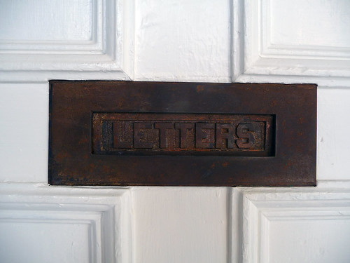
We don’t use this mail slot (mail is so much BIGGER now than it was 120 years ago!), but it’s super cute. I usually like to coat rusty metal hardware with flat black spray paint, but I actually like the rust on this guy—maybe because this was one of the first things in the house that I stripped a million layers of gooey paint off of.
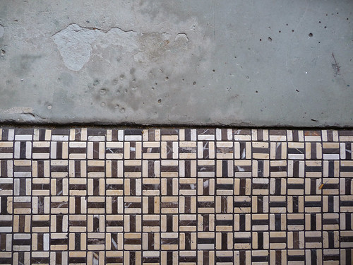
The step-down to the porch is a giant hunk of slate. I love it. This photo makes it look like the tile is lower than the slate, but I promise everything is nice and level!
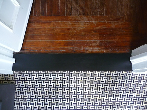
See? We did wind up going with the world’s largest threshold (just a 42″x6″ oak board, stained black and coated with polyurethane), and I’m very happy with it now that it’s in situ. And yes, the floor is still horribly scuffed, and it will remain so for the foreseeable future!
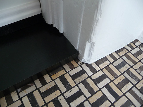
I wanted to include a detail shot to emphasize my belief that sometimes “good enough” is good enough. I don’t fret over every gap (that’s what caulk is for!) or worry when molding is damaged. My house is old, and it’s been through a lot. It’s never going to look like new construction, and I am more than okay with that.

Unfortunately, I don’t think I have any real “before” photos of the vestibule, so you’re going to have to take my word when I say that it was gross. All of the woodwork was painted either high-gloss brown or forest green, and the walls above the wainscoting were covered with fake-wood paneling (graffitied with the catchy tagline, “Mr. Bojangles”). There are some pictures here of the hideous tile that we ripped out (demo shots!).
Sources, in case you’re curious…
Black paint: Benjamin Moore “Black Beauty”
White paint: Benjamin Moore “Simply White”
Wallpaper: Orla Kiely “Flower Blossom”
Tile: U.S. Ceramic Tile “Marfil Brown” (with black grout)

76 Comments
Congratulations! It looks great!
Yay and congratulations! I love the “world’s largest threshold”. Everything has really come together and it must feel a little extra good to come home now.
Very nice! I love the tiles and the slate. We just don’t get architectural details like all o those in that tiny space on the west coast.
I love it! Whenever we get around to gutting and redoing our rear entry/bathroom (believe me, there is nothing worth saving), I want it to have a similar look to this. I was originally thinking encaustic tile for the floor, but I don’t think my house is quite old enough for it to look right. A mosaic-y tile with dark grout to hide dirt may work perfectly in the space. I love how it’s both modern and graphic and historic at the same time.
It looks soooooo nice in there! The tile is just perfect for that space. I love your white door, its details and especially the letter box. I think Sylvester approves too!
It looks absolutely beautiful Anna! I really like the threshold too, it goes very nicely with the tile! Sylvester seems to approve as well!
congratulations on a job well done….it looks wonderful
It looks so purdy! I like that it’s your taste, but still has that mosaic look that is traditional to many entry ways of homes from that period. You guys are getting the hang of laying tile down huh? Love it.
I love that tile. Vestibule looks great! Better than new construction. It’s the handmade touches and the little quirks and imperfections that make your place so beautiful and personal. It can’t be duplicated! (though it sure makes me want to try)
So classic! I love what you have done by incorporating the wallpaper! And those doors….I would give my left arm for them!
Great work, love the wallpaper and of course fabulous selection of tile. I am impressed. Since I am from Europe I am curious what is the main purpose of having vestibule in your country? Here is mainly for stopping cold/bad weather going directly into house….
Love it! It makes me want a new front door and to do something about the terrible threshold that (un)welcomes folks to my home. (And 12 years in I’m sure we’ve done way less to our house than you two have so please don’t ever fret … it just takes time, even when you accept that good enough is good enough.)
@Natasha: I think vestibules serve that very same purpose all over the world. 🙂 It’s not common to see them in houses anymore, though—it’s something that was mainly specific to the Victorian era in this country.
Saw your tweet about the bridge fire . . . how everyone is safe. Do you take your cat with you into the city for the week?
@Hayes: The cat is a stray! 🙂 The dogs come with us back and forth. (The bridge fire is out, by the way—no one was hurt, and the trains are running again.)
Oh my this was SO worth the wait! I love every single thing about it, every detail – and the imperfections make it even more perfect (imo).
Funny, I was going to ask if, 4.5 years later, you still love the wallpaper you chose – but I see you thought ahead to that question!
Very well done. I’m in love with that tile and want to buy some and put it away in storage until I have somewhere to use it……
I die for this! What a fantastic way to enter a space.
http://thelonelywifeproject.wordpress.com/
Lovely job, again! x
Gorgeous, gorgeous, gorgeous.
Just perfect.
That tile and grout is just gorgeous! You have a real knack for picking tile I think.
I love it! The wallpaper is one of my favorites, too. I didn’t know it was still available, so thanks for the link – thinking of using it in my tiny half bath.
The vestibule must feel so nice to come home to! I know when I walk in the door my mood is instantly set by how clean or messy my entryway is.
OH it looks so great! SO GREAT. Also, Sylvester is looking great too (super creepy memory, up to its old tricks)!
Did you use a clear coat kind of seal on the mail slot at all?
Everything looks great! One would almost think that tile is original. Nice pick!
Ooooh Anna!
It looks so Anna! I finally got around to ordering a sample of that tile (special order only in my HD) to see what it would look like in a shower…. Your vestibule turned out great!
Congrats!
Congrats – looks amazing and is very inspirational, like pretty much everything else you do. I really enjoy your blog!
Amazing! Great work, Anna!
Congrats! I’m happy your sweat and toil paid off!
you rock Anna!!!! love your blog , love your vestibule and understand why that stray kitty seems reluctant to depart…
please continue to be yourself! 🙂
It’s beautiful!
lovely!!!
wow! the tiles are gorgeous! the whole place looks so beautiful and simple. well done, you!
Looking good ! But not as cute as Sylvester 😉
i can’t add anything new, but you both did a really terrific job!
That looks fantastic. You have such good taste!
Completely lovely. Congratulations on finishing it. Also, it sets off the cat nicely. 😉
this looks so good. great choice in tile.
Your entry looks amazing, and it always makes me feel better to hear your take on living with an old home, particularly as I deal with the many problems in my own 100 year old home.
Off topic. I saw Janelle Monáe on Sunday (she opened for Of Montreal). As much as I love Of Montreal I have to admit I like her performance better. For the encore, Janelle and her crew came back on stage with Of Montreal and they did a whole MJ montage complete with Janelle doing the moonwalk. I thought of you.
Impressive! I love the wallpaper..Gosh you’re brave…it would have done my head in that it took so long to renovate.
http://bodieandfou.blogspot.com/2008/07/london-loft.html
Wow! It looks amazing! Great job!
Best looking vestibule I’ve ever seen.
wow that’s really awesome. i wish i had an older home that had some great architectural features like this, but that’s the downside to new construction.
i really enjoy the wallpaper pattern and have been contemplating doing a wall in my home with a really bold print/ design. after seeing your space it makes me a little braver to try it out 🙂
So nice Anna, I admire your patience. And that wallpaper of yours looks great!
It’s so lovely – fresh and clean. Somehow that wallpaper seems retro but the vestibule feels modern and yet fitting to the old house at the same time – really great choices.
Also, thanks for your frankness in how long it took and how “done” can be “almost done.” I often feel the same way about my projects – “I worked so long and so hard and everything is done except for one little piece of molding that no one else will notice . . . okay, move on!” I think that kind of attitude goes hand in hand with “my house is old, it will always have its flaws” attitude. It’s really comforting to know that – especially as Door Sixteen looks so perfect in the photos!
This is absolutely amazing. I love, love, love the coated oak board and of course the tile. I have gotten into a mindset where I actually like adding to the worn look of my apartment, probably mostly so that when I clumsily cause a scratch in the floor I don’t freak out, but still I would never want it to look like new construction either. Great job. It’s beautiful.
Beautiful!
It looks great! I really like the little letter-slot and the floor and the wallpaper and…just everything.
(I hope I am allowed one suggestion: What about If you switch the first two photos at the beginning of this post and don’t put textlines inbetween, maybe something like a vertical panoramaview of the vestibul will appear and give the impression looking at the whole room and still shows all the details we all like to see? Its just an idea…)
@Leonie: You are allowed as many suggestions as you want to make! 🙂 You know, I actually tried that!! I took the photos with that intention, but in execution it was just…I dunno, too much. I have a hard time photographing vertical spaces in a pleasing way. I wanted it to work, though, I really did!
Hi Anna,
I found you at Benita Larssons..
Just wanted to say that being English I really really appreciate a nice substantial threshold, and the two you’ve incorporated are beautiful. I know.. I’m strange… ;o)
Also the detailing on that white interior front door is ABSOLUTELY exquisite.
You mentioned that you are repainting the exterior front door.. are you going with a different colour or are you just retouching the existing paint ??
Jo xx
@Jo: Just retouching with the same color. 🙂 We had some brickwork done last year that created a lot of dust, and the door got quite dull and a bit gray in the process.
I am in total awe. Simply amazing and wonderful and brilliant. Love love it.
Wow!
Absolutely beautiful! Wonderful job!!!
Stunning! It looks sooo great. I can’t believe how affordable those tiles are, b/c they look like a million clams.
I am in love with this space, really beautiful!
Super lovely. This is the mix of historical and modern that everyone is always trying to nail down, and it seems like you’ve done it really beautifully here. Reminds me of the incredibly classy London row houses I always used to pass, with wonderful inlaid tile/marble beneath the main stairs with their street number – big bay windows – great historical touches – modern style added in. It’s my dream via Living Etc magazine.
Ok, enough of the dream session. The vestibule concept is one I really like – my current house has nothing over the front door, so the door gets wet and dirty when it rains, people are waiting out in the elements while you’re running to the door – I’m astounded by how unwelcoming it all feels.
Elegant home interance makeover. Good work.. i love the latter box, looks classic 🙂
It looks gorgeous! Great job!
I always wonder, though, why front doors always open “in.” Is there some kind of law about that, so that people can’t block your egress from the outside? If the doors opened “out,” as mine does in Canada, you could use the vestibule space for more than just door clearance. It could accomodate, say, and Eames Hang-it-all…
Wow, it’s gorgeous! Well done!
Hey Anna, IT LOOKS GORGEOUS!! Doesn’t it feel good to cross that stuff off? Oh, BTW, you didn’t give the source on the kitteh. 🙂 (Do you know about this blog that I tripped over last night? http://www.whatkatiesaw.blogspot.com I just love these design blogs, because good design is so wonderful on so many levels.) S
Wow – looks fantastic Anna, congrats!
Still loving the Orla wallpaper… I just scored some of the Blossom bedding in the chartreuse massively reduced. Over the moon and can’t wait to put it on the bed 😉
Beautiful! Just curious to know what you use to strip paint. I have spent all of today (Saturday) trying to strip 40 years of paint from the door jamb of my bathroom so that the door actually closes. Citristrip and hard-scraping has removed 85%. I may be able to get the rest of it tomorrow using the same method — it is probably a bit much to ask one product to remove that much paint. I feel like an archaeologist. Thanks.
@Audrey: I use the crock-pot method (see TOH article for more info!) for hardware. For wood I have had good luck with Citrustrip (for me, it’s worked better than Peel-Away, but if you haven’t tried that, give it a shot—different things work for different kinds of paint/shellac), but there’s always good old paint stripper, scraping, and sanding. If you’re repainting the jamb after you clean it up, at least you don’t need to worry about getting every last bit of paint off! 🙂
Wow, you guys did a great job! Well done! We live in a Victorian terrace house in the UK and we too have the area around our front door on the list of things ‘to do’. Older homes are so much work but so worth it! Thanks for the inspiration and have a happy weekend.
Looks amazing. Love the tile choice and the black grout. How much of a bitch was it to grout with that dark color? I bet you were wiping for days. Or did you seal the marble first? I want something similar for my vestibule. It’s on the very long list of things to do.
I’ve been waiting forever for this reveal! Looks amazing. Great job.
So many gorgeous details – I love the way they came together!
Great job. Love the pattern of the tile, design of wallpaper and black and white. And Mr. Bojangles complements and compliments all of the above and gives his approval.
BarbaraG
It’s perfect. I freaking LOVE it!! And the “letter” slot on the door is wonderful… it would be way less charming to paint it (in this case – but I get you on flat black spray…) Soooo good! And so nice to cross it off your list! Yay for you!!!
Anna I have to confess – I copied your idea EXACTLY for our foyer at 264 Grand St. Yes, I am renovating a lovely old Newburgh house too! We finished the foyer yesterday and it is truly gorgeous. The best thing is that it looks like it has been there since 1890. I tried to show some originality by adding a dark brown border, but the tile never came in so we went with the field of little tiles, only difference is we used chocolate grout, not black (concession to my husband). I love your site – you give me hope when I am feeling overwhelmed with old house problems and Newburgh issues. Please don’t stop!
Your choice of tile (and grout) is BANG ON! It looks like it has been there since the house was built but it is TIMELESS.
Love the wallpaper too 😉
Looks fabulous… I love the tile!
hi
A really, really great friend sent me the link to your blog this morning. This is how far I’ve got today! I love your blog, thanks for sharing… and the vestibule looks amazing, your house is so inspiring (I rent a beautiful, but more wonky, Victorian in Boston) and I know, nothing is ever finished. But good enough is awesome. Congrats on the black walls, too. Delicious!
kbd
One of my favorite renovations in your house so far. Historical question: With the mail slot on the interior door, do you think, when the house was built, the outer door was left unlocked for the mail carrier to enter the vestibule?
Yes, it would have been unlocked. Many of the vestibules in my neighborhood are still unlocked on the outer door to allow access to the mailboxes inside (a lot of the houses have been converted into multi-family apartments), actually.
I wish we could still use the mail slot, but it’s soooo tiny. It can’t really handle anything bigger than a business envelope.
I really, really love this! The floor, the wallpaper, and the crisp white paint on the door! Just fantastic.
I love coming to your site for inspiration. Your work is so drool-worthy. *sigh*
I could browse all day… 🙂